Labs2026Side project · 12 min

The research tool that tells you what to measure before you test.

Testify is a usability-testing tool I designed and built for myself, then turned inside out: from a study builder, which helps you run a study you have already designed, into a study planner, which starts from what you want to learn and works out the success metrics, the session, the prototype fixes and the fair comparison before anyone sits down. The hard part of research at myKaarma was never running the session. It was deciding what "better" meant.

Role
Designer, researcher and builder, solo, with AI pair-building
Context
Testing B2B dealership tools with parts staff, advisors, technicians and BDC agents
Timeline
Phases 1 and 2 earlier in 2026 · phase 3 October 16–18, 2026
Built with
React, then one self-contained HTML file and a small Cloudflare Worker · Gemini for planning and summaries · PostHog, Supabase, Google Sheets for results · Cloudflare for hosting, publishing and team sign-in

Try it

Plan a study the way Testify does.

Press Plan it to watch the real plan for the Parts study build itself: research questions, measures, the fixes only you can make, and the session.

TTestify/ Parts UI · pre-approved vs recommendationsSample plan · the first real study

1 · Describe the study

Talk it through or type. What are you testing, what are you unsure about, what would make you confident?

🎙 Dictate · in the real tool
A · Current — filter tabs at the top; pre-approved line nested in a green concern card; inline DMS and part-not-found errors.
B · Proposed — status filters as chips; pre-approved shown as its own section with “Approved at write-up”.
In Testify a model drafts this from your words and asks 3–5 questions first. Here, the plan is the real one from the Parts study.

The plan appears here: research questions, success metrics with targets and the activity that measures each, predictions, the things only you can fix, and the session.

01 · Plan

The problem

Off-the-shelf tools assume a world I don't work in.

Maze, UserTesting and the rest assume Figma prototypes, consumer participants and a researcher with time to design every study by hand. My work breaks all three. My prototypes are coded, with real states and real errors, and teams that test seriously have moved the same way; click-tracking on a Figma frame cannot see whether someone actually finished. My participants are parts-counter staff and service advisors who have minutes, not hours. And the part that took most of my time was never running the test; it was deciding what success meant, which activity would measure it, and whether the two versions were even a fair comparison. That is exactly where existing tools give no help. They start at "add a task".

PrototypesCoded, not Figma framesReal states, real errors, scored inside the prototype
ParticipantsBusy professionalsParts counter staff with minutes to spare. Every task has to earn its place
The researcherMe, part timeNo dedicated research function; the judgement has to be in the tool
Decide what "better" means before you look at the data. The habit I brought from conversion work, turned into software. The planner above is that sentence, running.

02 · Build

Phase 1

I built the study builder first. It was the wrong tool.

The first Testify was about a thousand lines of React: a working, Maze-style builder with six test types, a block editor, a participant mode joined by a short code, shared storage, and a results view with a first-click heat map. I reused the patterns participants already know so the tool would not become the thing being tested, and kept it to a single file so it could run anywhere. It fell short in three ways that all pointed the same direction: upstream.

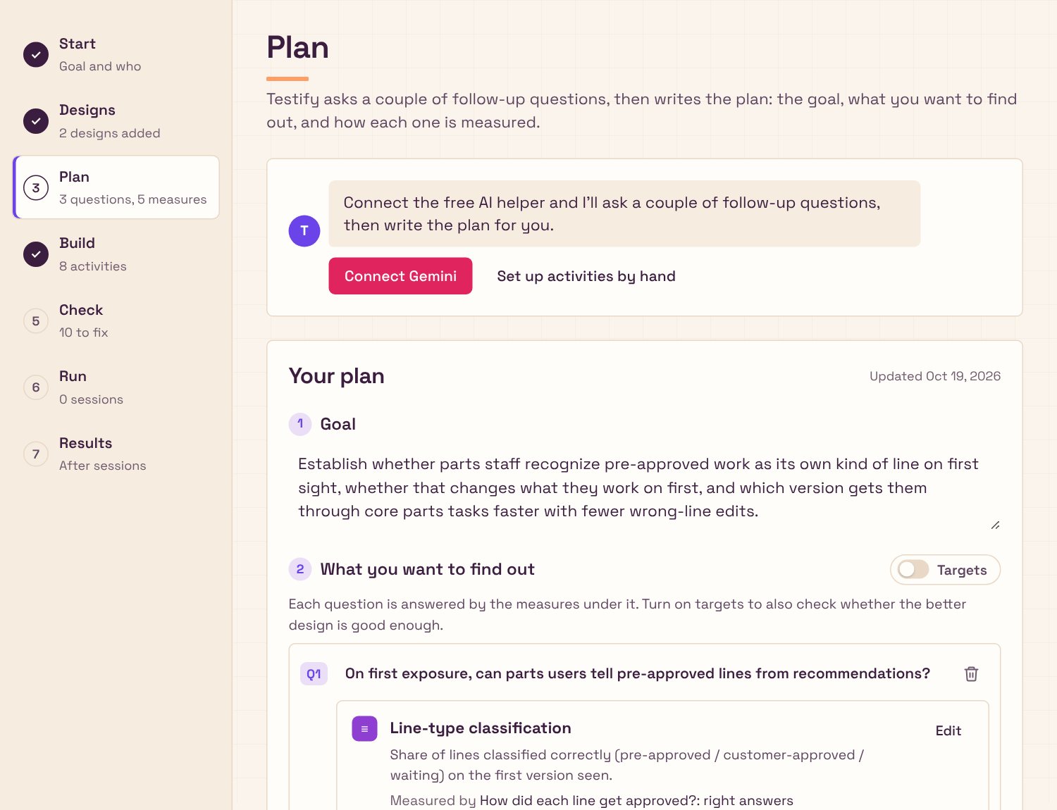
A study in Testify: seven steps down the left, from Start to Results, with the Plan step open.
Where it landed: seven steps, from Start to Results. Phase 1 had only Build and Run.
1
Success was self-reported.A participant who gave up and clicked "Completed" looked like a success.
2
It could only run a study I had already designed.The thinking still happened in my head, at five o'clock.
3
It had no idea of versions.Comparing A with B meant two studies and a pair of eyes.

Try the first gap

Said done versus actually done.

Task: source the pre-approved part for this line.
Diagnosis · approved at write-upno parts · labor only
nothing to source
CV axle boot · awaiting decision44305-TBA-A01 · qty 1
Brake pads · pre-approved45022-SNA-A00 · qty 1
Try finishing the task, or just say you did.
How Testify reports it
Reached the right state0
Said done, but hadn't0
Wrong-line edits0

The tagged element is the real "done". "Said done, but hadn't" became its own group in the results, and one of the most useful signals in the tool.

02 · Build

Phase 2 · What I decided

Move the tool upstream.

The pivot was changing the tool's job. Instead of helping me run a study I had designed, Testify now helps me design it, starting from the goal. Each rule below is one piece of research judgement I had been carrying in my head, made explicit and handed to the tool.

Rule 1

Every metric names the activity that measures it.

You cannot leave the Plan step with a metric that nothing measures. Each success metric carries a pass direction and the activity that produces the number, and in phase 2 a target too ("at least 80% of lines classified correctly"). Anything unmeasured is flagged.

In phase 3 targets became optional. Comparing versions already says which is better; a target only answers whether the winner is good enough, and a junior designer shouldn't have to invent one to start.

This is the habit from conversion work: decide what "better" means before you see the data, so the data cannot talk you into a story afterwards.

ShippedResearch methodOwn practice
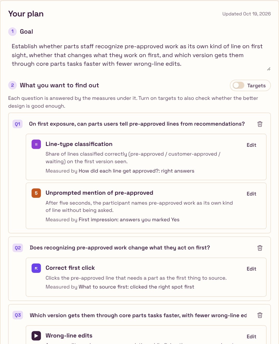
The plan: the goal, then each research question with the measures that answer it and the activity behind each one. Targets are a switch, off by default.
Each measure says which activity produces it. Targets are a switch, off unless you want them.

Rule 2

Tasks finish when the prototype reaches the right state.

A prototype task is complete when the tagged element has actually been reached, not when the participant says they are done. You tried it above. Testify tags the prototypes itself: drop in an HTML file, it finds the buttons and lines each task refers to, marks them, and hands you back a tagged copy.

ShippedMeasurementPhase 1 failure
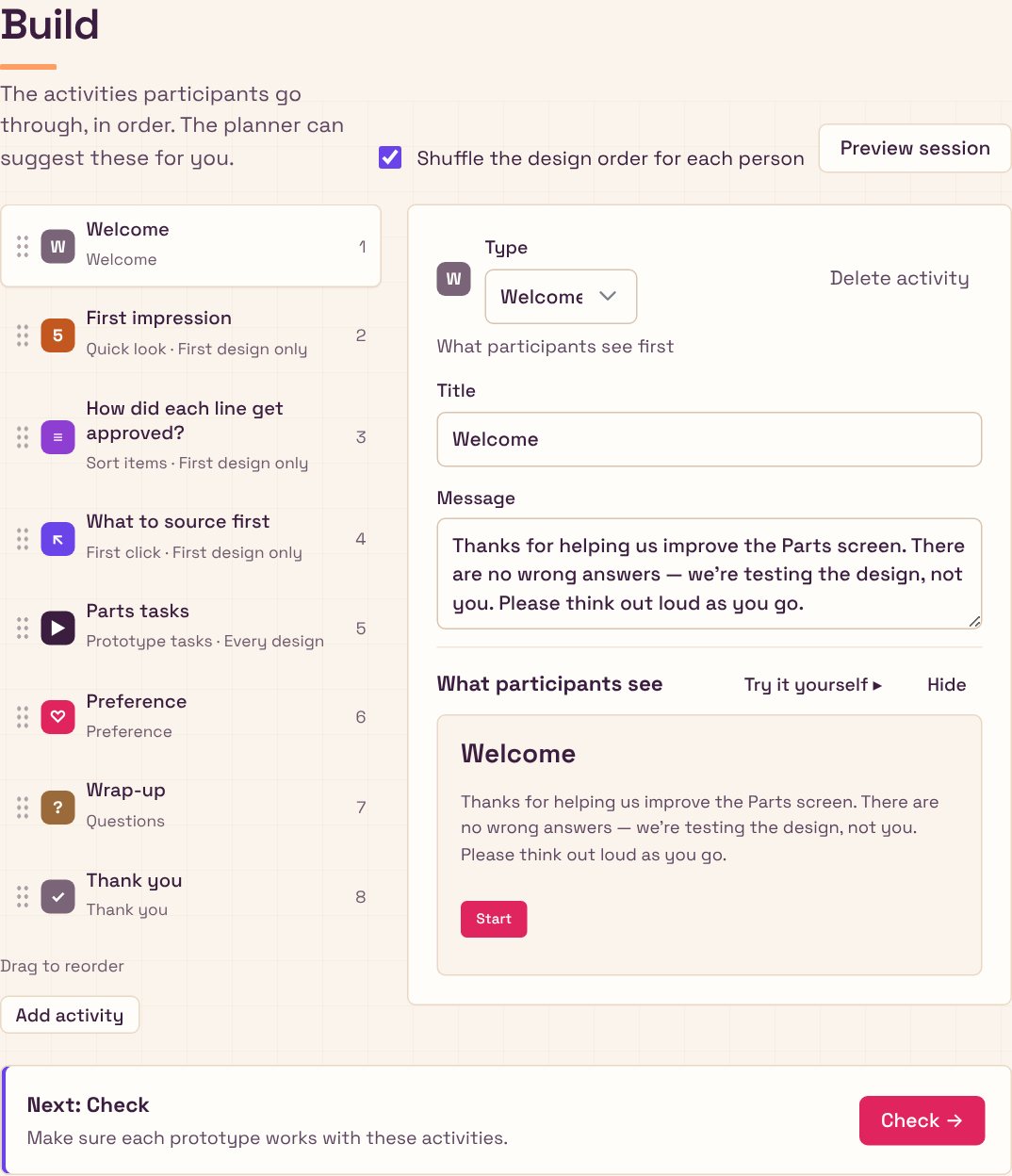
The Build step: eight activities in order, each marked First design only or Every design, with a preview of what participants see.
Eight activities, set up from the plan. The prototype tasks score themselves.

Rule 3

Comprehension questions run on the first version only.

By the time a participant sees the second version they have already learned the concept, so asking "what is this?" again measures memory, not the design. Five-second impressions, classification and first-click run only on the first version a person sees; task performance runs on all of them. It is the kind of judgement a researcher carries in their head, and the kind that gets skipped at five o'clock.

ShippedExperimental designOwn practice
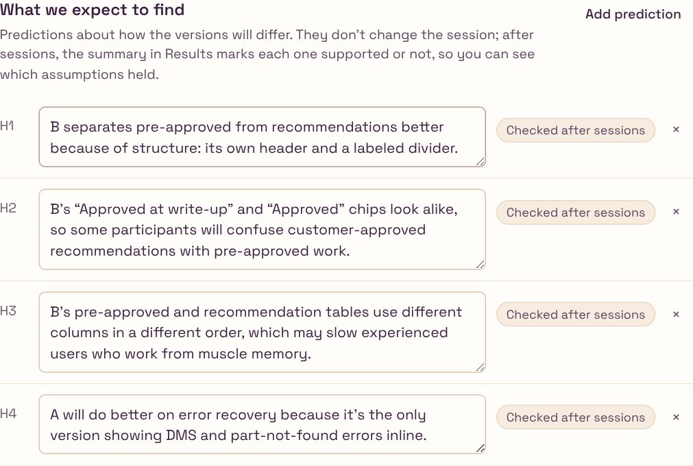
What we expect to find: four predictions, each checked after sessions.
Predictions written before the session, so the summary can mark each one supported or not afterwards.

Rule 4

Flag what differs besides the design.

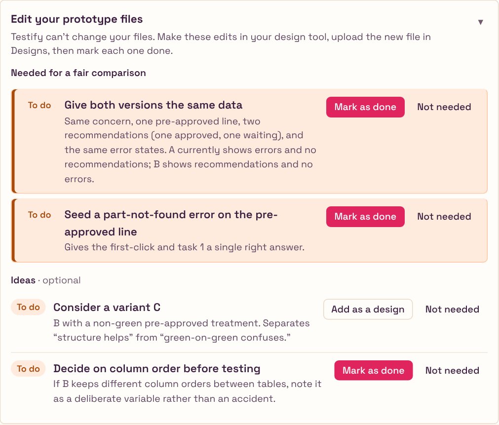
The planner checks whether the versions differ in more than the thing being tested (different data, missing error states) and lists those as must-do fixes before testing, separated from optional ideas, with Done and Skip states and a count of what is left.

On the very first real plan this caught a flawed A/B before any participant's time was spent. That alone paid for the rebuild.

ShippedValidityParts study
Edit your prototype files: what's needed for a fair comparison, such as Give both versions the same data, kept apart from optional ideas like a variant C.
Must-dos and maybes, kept apart. The must-dos gate the test.

Rule 5

Anything safe to automate is automated, with undo.

I wanted my time on judgement, not setup. Session setup, prototype tagging and pulling results happen on their own, every automatic action can be undone, and the end of every step has a next-step banner so there is never a question of what to do now.

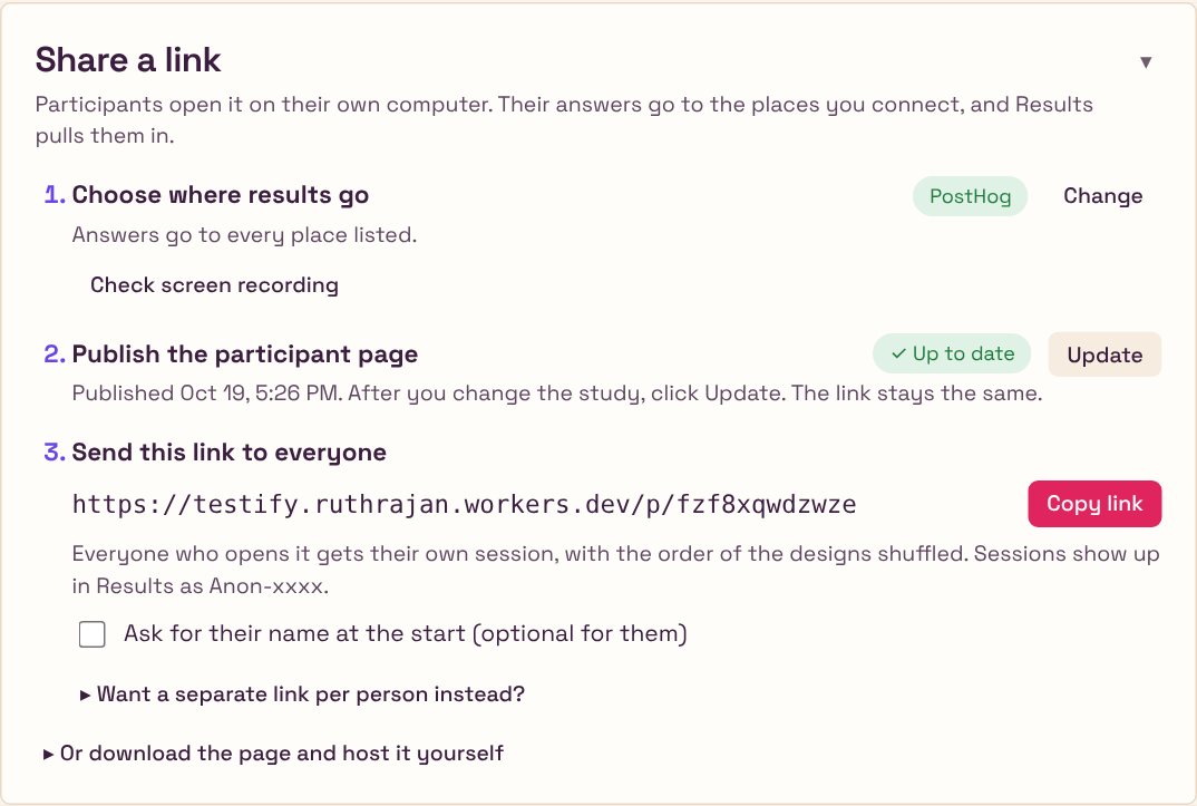
Participants need no account, and since phase 3 everyone gets the same link, with the design order shuffled for each person. One Publish button puts the study online, and Update keeps the same link after every change; a single downloadable HTML file stays as the fallback. Answers go to PostHog, Supabase or Google Sheets, services I already control, and read keys never leave my browser.

ShippedAutomationOwn usage
Share a link: answers go to PostHog, the participant page is published and up to date, and one link goes to everyone.
It used to take four steps, including downloading a file and hosting it. Now it's Publish, and Update after a change. The link stays the same.

03 · Run

The Parts study

The first real plan caught the flaw before the test did.

I used Testify's first real plan on a live question at myKaarma: which version of the Parts screen works best for parts staff, and is the new pre-approved section understood as different from recommendations? Three research questions, each with the activity that measures it and a target decided in advance.

Research question
Measured by
Target
Can they tell pre-approved from recommendations?
Line-type classification on the first version seen
≥ 80% correct
Does recognising it change what they act on first?
Correct first click; unprompted mention after five seconds
≥ 70% first clicks · ≥ 60% mention
Which version is faster with fewer wrong edits?
Prototype tasks on every version, scored automatically
≤ 1 wrong-line edit · ease ≥ 5.5/7

The planning stage surfaced four things before a single session ran.

UnfairThe comparison wasn't fair yet.A showed errors but no recommendations; B the reverse. Both now get the same data.
Vague"Understood" needed a behaviour.Defined as sourcing pre-approved work right away, so it could be measured.
RiskTwo near-identical green chips."Approved at write-up" and "Approved". The plan added a task that asks how each line got approved.
IdeaA variant C.Neutral colour for pre-approved, to separate "the structure helps" from "the colour confuses".

Results: the Parts sessions are still running; which version won, and what changed in the shipped screen, will be added when they report.

04 · Results

What exists now

A planner, not a timer.

A seven-step tool, from Start to Results, in one self-contained file, eight activity types including self-scoring prototype tasks, remote sessions through one published link with results landing in PostHog, Supabase or Google Sheets, heatmaps and click paths for every prototype task, and an end-to-end test suite covering sessions, scoring, export and merging. I was also its first user, so I ran a heuristic audit against Nielsen's ten principles on my own work and fixed what it found.

✓Contrast raised from about 3.3:1 to about 5:1 on secondary text.
✓Focus stays put. It used to jump to the top after every click.
✓Undo on deletes, and a visible save status.
✓Jargon I had invented, renamed. Counterbalance version order → alternate which version people see first. Blocks → activities.
✓Must-dos split from ideas; next-step banners; auto setup with undo; export; checked hypotheses; drag-to-tag.
Before · 3.3:1Optional. Testify names it from your goal if you leave this empty.
After · 5:1Optional. Testify names it from your goal if you leave this empty.
The same helper text, before and after the audit. WCAG AA asks for 4.5:1 on body text.

Shipped as

One file

Seven steps, Start to Results, in about 470 KB, plus a small Cloudflare Worker for publishing and sign-in. No accounts for participants.

Activity types

8

Including prototype tasks that score themselves and line classification.

Before any session

1 unfair A/B

Caught by the planner on the first real study.

Own confusion

7 fixes

From the heuristic audit of my own tool.

Open

Pending

Participants reached, which version won, time saved per study versus planning by hand.

Method: own use across two real studies; a heuristic audit against Nielsen's ten principles; an end-to-end test suite.

05 · Phase 3

Three days in October

From my planner to a tool someone else can run.

Over three days, October 16 to 18, Testify went from a planner only I could drive to a hosted tool with its own look, voice and participant flow. The bar I set: a junior designer, new to research, should be able to plan and run a fair study with it.

What I changed

Fewer questions, fairer versions.

✓Setting up. Hosted online, with storage so old studies are kept. One shared participant link instead of one per person. The code on GitHub, so I can work from the cloud or my PC, not only my Mac.
✓Fair prototypes. A current, a proposed and a neutral pre-approved version of the Parts prototype, all with the same realistic data and no developer-only alerts, with the differences made easier to see.
✓Simpler for a junior designer. An audit of the whole tool for someone new to research. Plain words, one question per screen, and questions that didn't help taken out. Targets made optional, and called targets, not goals. The tagging screen gone, and screenshots allowed when there is no prototype.
✓The flow. It starts with a chat: the study's name, what you want to learn, and whether you have designs. Prototypes come after the questions. A viewer flips between versions and takes screenshots, a Check step confirms PostHog is recording, and Next buttons say where they go.
✓Look and voice. A branding deck to find the voice, then my own mix of its directions: sharpened type, warmth and cream, and colours with one job each: pink only for the main action, violet for links and highlights, amber for what needs attention. Folds for long sections, and my gestalt rules: related things grouped, labels left, actions right.
✓Feedback and control. A Save button with a saved state, confirmation and Undo when marking something done, and Remove that looks like remove.
✓Participants. Answers required by default, with Optional per question. A Back button, zoom on pictures, and questions that say which version they're about. Tasks that finish only on the right action or "I'm stuck", a first click that ignores stray clicks, and a warning when an ad blocker stops the study. Confidence and ease questions stay off unless asked for, and the task card lights up when the next task starts, because a prototype that reloads looking the same reads as stuck.
✓Publishing. One Publish button gives a link participants can open, and Update republishes after a change with the same link. No more downloading a file and uploading it to a host.
✓Team sign-in. Coworkers sign in with their work email and get the team's connections automatically: no setup codes, no keys to paste. Studies stay private until shared, and each one can go to the whole team or to named people, as view or edit; viewers can duplicate to make their own.
✓Results that say what to do. A heatmap over the real prototype for each task, the most-clicked controls with wrong ones marked, and the common click paths. The AI summary reads clicks and answers together and comes back with what to change first, themes with word-for-word quotes, and what to look into next.
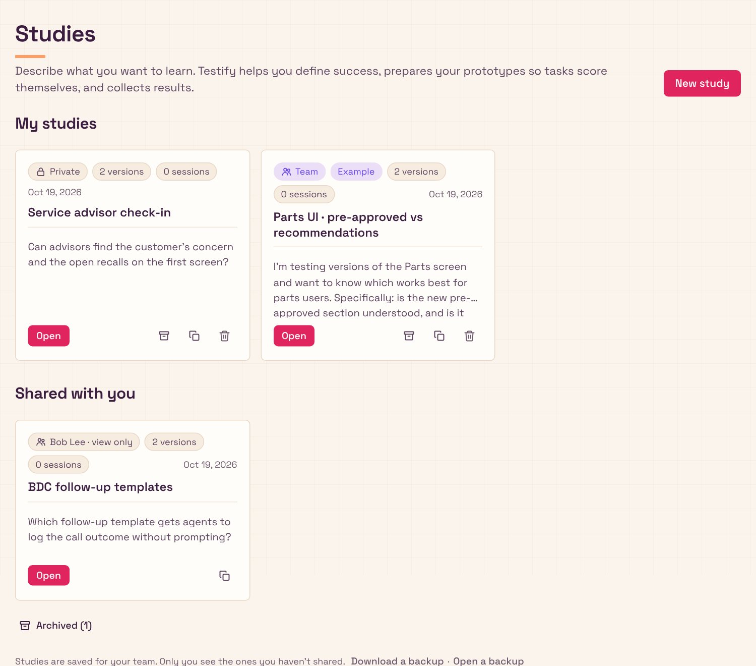
The studies home when signed in: My studies, each marked Private or Team, Shared with you from a teammate, and the archive.
Signed in: your studies, marked Private or Team, what teammates share with you, and the archive.
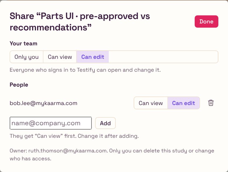
Sharing one study: the team can view or edit, plus a named person with edit access.
Sharing is per study: the team, or named people, as view or edit.
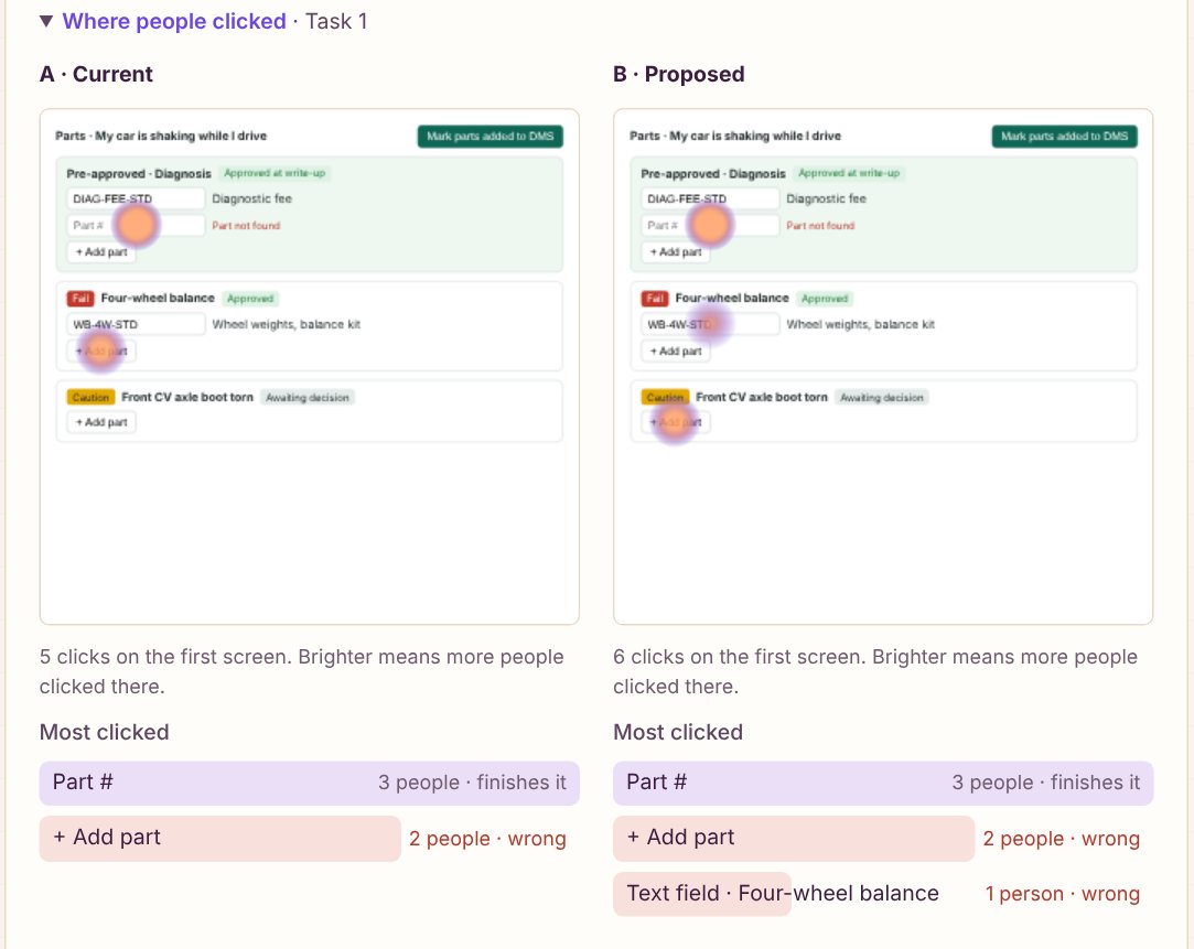
Where people clicked on task 1: a heatmap over each version of the prototype, and the most-clicked controls with wrong ones marked.
Where people clicked, drawn over the real prototype. From six practice sessions, not real participants.

The look

Each colour has one job.

Warm Studio: Space Grotesk throughout, a cream page with a faint graph-paper grid, plum ink, crisp 6px corners and almost no shadow. This page wears it too.

PinkMain actions only. As a highlight it read as an error. #E0245E
VioletLinks, selection, focus and highlights. #6A44E8
LilacSmall soft surfaces: chat replies, selected tabs. #EADFF7
AmberNeeds attention, never an error. #A64B0C
ApricotSmall decoration, like the heading underline. #FF9E64
Cream and plumThe page and the ink. #FBF4EC · #3B1D3F
Design decisions

Decisions that became features.

Method

  • Shuffle the design order.Each person sees the designs in a different order, so none always goes first.
  • Make targets optional.Comparing designs works on its own; switch on Targets to ask “is it good enough?”
  • Always offer “Not sure”.Sorting questions include it, so a lucky guess doesn't count as right.
  • Show the AI the screens first.Its follow-up questions match what's actually on screen.

Fairness

  • Only the tested thing may differ.Check marks every other difference Intended or Fix before anyone takes the study.
  • Alerts and placeholders count.An error message or broken image in one version gets flagged as a fix.

Voice and focus

  • A voice is a short rule set.Fact first, then one line of why. Two sentences at most.
  • Focus isn't selection.Focus has its own style, so it never reads as “chosen”.

Sharing

  • A link, not a file.Publish once, Update after changes; the link never changes.
  • Sign-in is the setup.Teammates get the team's connections when they sign in. No setup codes.
  • Private until shared.Every study shows a lock or Team, and shares as view or edit.
  • A blank browser can't win.Connections fill gaps; a fresh window never wipes the team's setup.

Data and privacy

  • Two kinds of analytics key.The sending key goes in the page; the reading key stays private.
  • Trust only real replies.Participants are warned when an ad blocker quietly fakes the analytics.
  • Record labels, never typing.Clicks store what a control says, not what someone typed.
  • Clicks need quotes.Results pairs heatmaps and paths with what people said, then says what to change.

Habit

01

Check the versions differ only in what you're testing before anyone takes the study.

Habit

02

Try the study yourself in Preview, then once for real in a clean browser.

Habit

03

Publish once, then press Update after every change. The link stays the same.

Habit

04

Wait a few minutes before deciding data is missing.

Habit

05

Write down what future sessions should know, so the tool's context doesn't live only in my head.

06

Differently

What I'd change with hindsight.

I'd have started with the planner. Phase 1 was a competent copy of tools that already exist; the thing that was actually missing was upstream of all of them, and I could have seen that from my own notes if I had read them as research.

I'd have split the Plan page into steps sooner. It is long, and the heuristic audit confirmed what I already felt every time I scrolled it.

What it doesn't do yet: it won't find participants for you, so you bring your own. Heatmaps cover each task's first screen only. And the AI summary has still to be judged on a real study, not a sample one.

Next case study · Canvas Dashboard

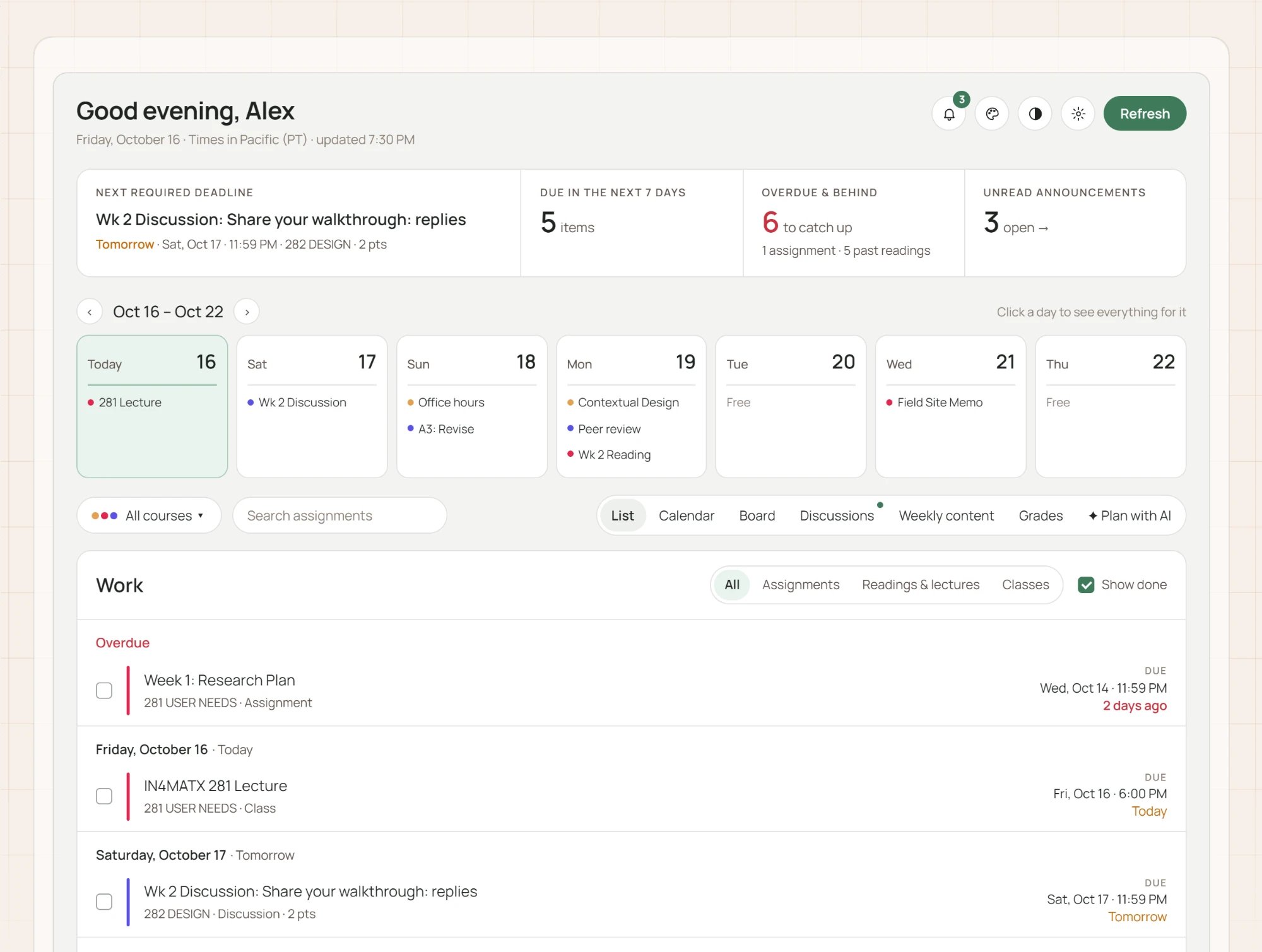
A semester on one page.

Read the case study