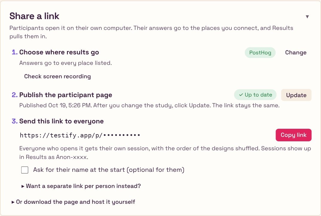
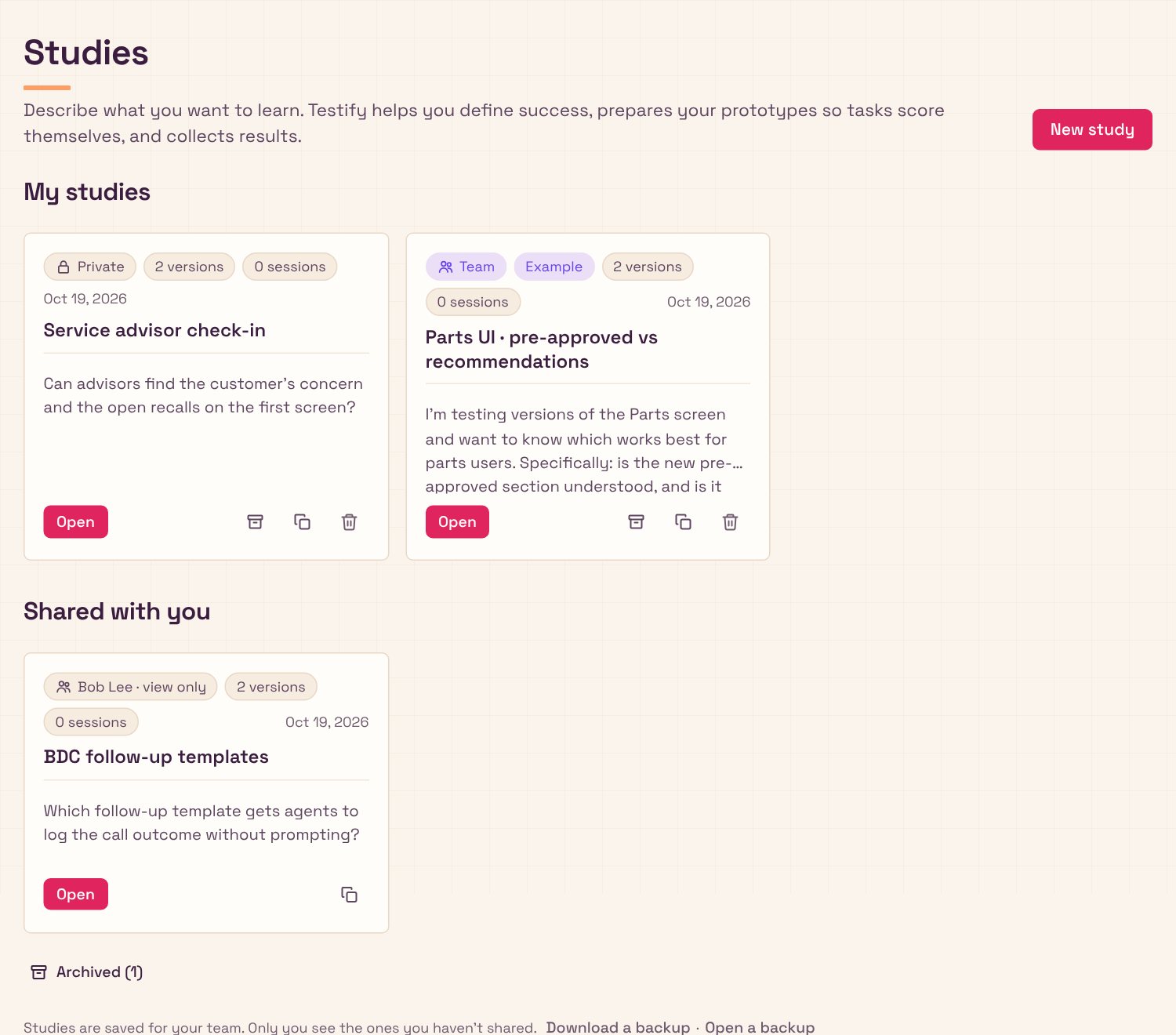
✓Setting up. Testify is now hosted online, with storage so old studies are kept. Participants share one link instead of getting one each. The code lives on GitHub, so I can work on it from the cloud or my PC as well as my Mac.
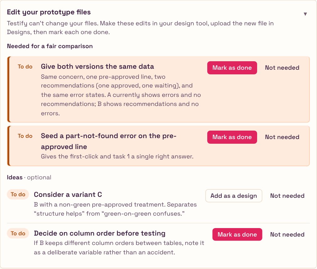
✓Fair prototypes. The Parts prototype now has three versions: the current screen, the proposed one, and one that shows pre-approved work in a neutral color. All three use the same realiztic data with no developer-only alerts, and the differences between them are easier to see.
✓Simpler for a junior designer. I audited the whole tool from the point of view of someone new to research. It now uses plain words and one question per screen, and I took out questions that didn't help. Targets are optional, and they're called targets instead of goals. The tagging screen is gone, and you can use screenshots when there's no prototype.
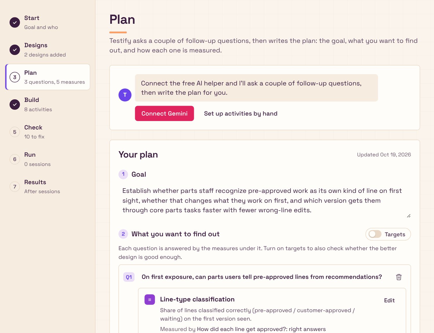
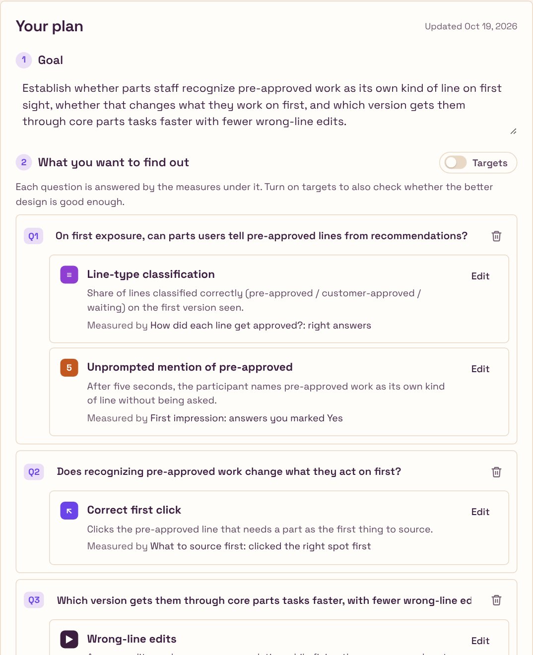
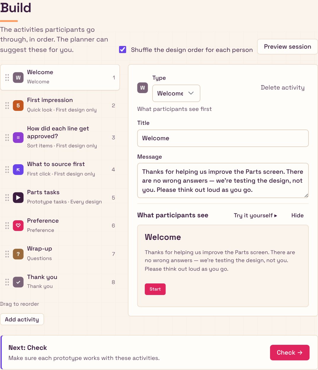
✓The flow. A new study starts with a chat that asks for its name, what you want to learn, and whether you have designs. Prototypes come after the questions. A viewer lets you flip between versions and take screenshots. A Check step confirms that PostHog, the analytics service, is recording. Next buttons say where they lead.
✓Look and voice. I made a branding deck to find the voice, then mixed its directions in my own way. The type is sharper, the palette is warm and cream, and each color has one job. Pink is only for the main action, violet is for links and highlights, and amber marks what needs attention. Long sections fold away. The layout follows my gestalt rules, based on how people see things as grouped: related things sit together, labels go on the left and actions on the right.
✓Feedback and control. The Save button shows when your work is saved. Marking something done brings a confirmation and an Undo option, and the Remove button now clearly looks like a remove action.
✓Participants. Answers are required by default, and any question can be set to Optional. Participants get a Back button, can zoom in on pictures, and see which version each question is about. A task finishes only when they take the right action or press "I'm stuck". The first-click activity ignores stray clicks, and a warning appears when an ad blocker stops the study. Confidence and ease questions stay off unless you ask for them. The task card lights up when the next task starts, because a prototype that reloads looking the same seems stuck.
✓Publishing. One Publish button gives a link participants can open, and Update republishes after a change, keeping the same link. There's no more downloading a file and uploading it to a web host.
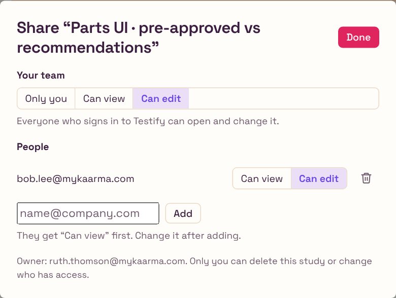
✓Team sign-in. Coworkers sign in with their work email and automatically get the team's connections to the services that store results, with no setup codes or keys to paste. Studies stay private until shared. Each one can be shared with the whole team or with named people, with view or edit access. Viewers can duplicate a study to make their own copy.
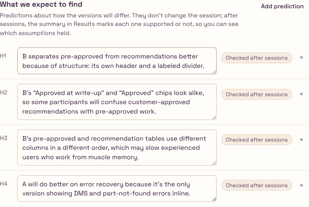
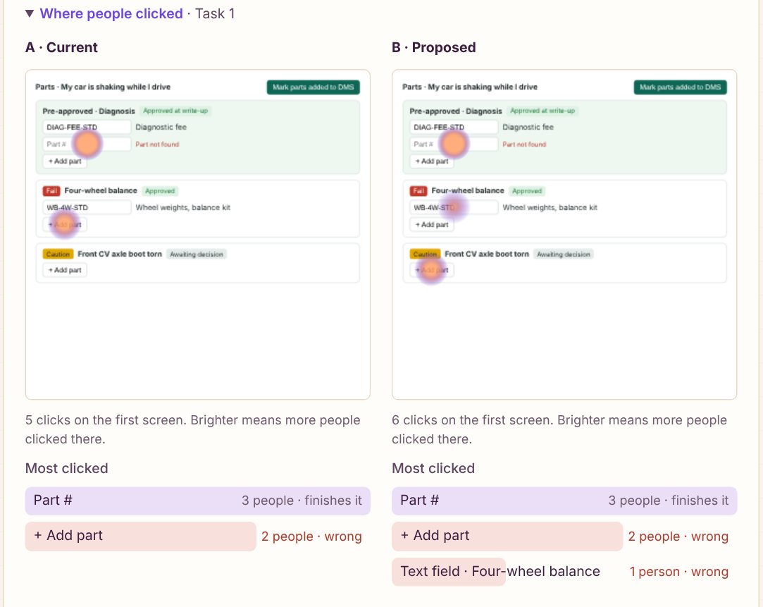
✓Results that say what to do. Each task gets a heatmap drawn over the real prototype, a list of the most-clicked controls with the wrong ones marked, and the most common click paths. The AI summary reads clicks and answers together. It comes back with what to change first, themes backed by word-for-word quotes, and what to look into next.
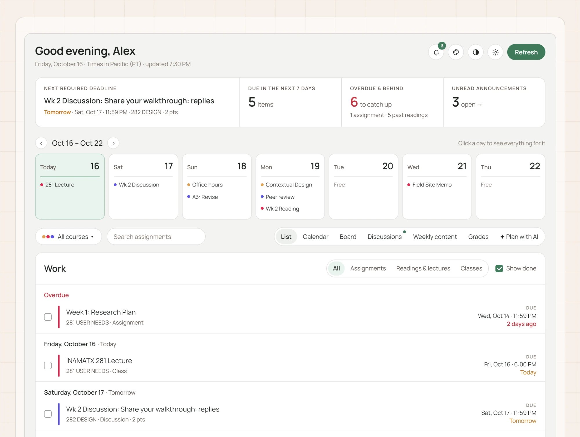
The visual style is called Warm Studio. It uses the Space Grotesk typeface throughout, a cream page with a faint graph-paper grid, plum-colored text, crisp 6px corners and almost no shadow. This page uses the same style.
PinkMain actions only. As a highlight it read as an error. #E0245E
VioletLinks, selection, focus and highlights. #6A44E8
LilacSmall soft surfaces: chat replies, selected tabs. #EADFF7
AmberNeeds attention, never an error. #A64B0C
ApricotSmall decoration, like the heading underline. #FF9E64
Cream and plumThe page and the ink. #FBF4EC · #3B1D3F