Fifteen recommendations, three people, one record.
RecLink is the screen a service advisor works from once the technician has finished the inspection: what the car needs, what it costs, and what the customer has said yes to. It was also the part of myKaarma most often called confusing. I rebuilt it as a working prototype with recommendations grouped under the customer's own concerns, pre-approved work made visibly different from new findings, and approval, parts and media handled in the same place.
A multi-point inspection produces a list of recommendations. The technician records them, the advisor prices and presents them, the parts counter sources whatever gets approved. myKaarma gives each person their own tab, but every tab is a view of the same underlying record. That made the project interesting and dangerous in equal measure: a change that reads correctly on one tab has to stay correct on the other two, and most of the bugs in this story were only visible with two tabs side by side.
RecommendationService advisorPrices the work and presents it to the customer
↔
PartsParts counterSources and prices what was approved, pushes lines to the DMS
↔
MediaTechnicianAttaches the photos and video that make the case
One record underneath. Change the shape of a recommendation anywhere and all three have to agree. You just did that in the estimate above.
What was wrong
A flat list of fifteen things.
The live tool showed every recommendation as its own row with its own price, in the order the technician typed them. The customer's complaint, the diagnosis that answered it and the work that followed were three unrelated lines. Advisors re-explained the connection on every call. Flip the list to see what grouping does to the same nine rows.
Nine rows, nine prices, no sense of which answers what. Pre-approved work looks identical to new findings.
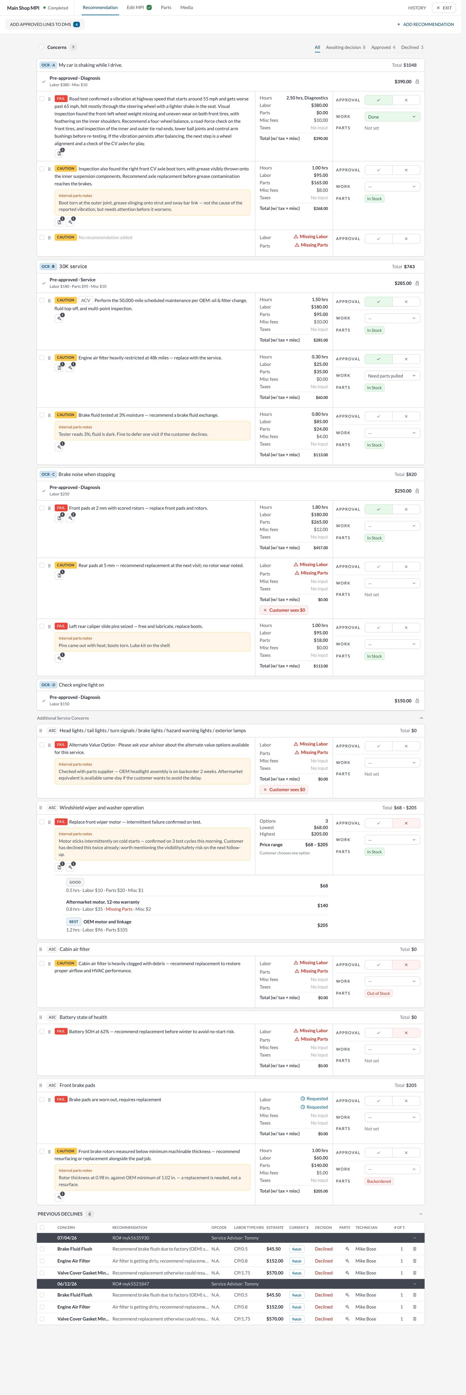
The real prototype, the whole tab. Scroll inside the frame.FIG. 01
02 · What I decided
Five decisions, and what each one fixed.
Each change below traces one idea through every place the data already lived. The pattern repeats: a first pass that looked right on one tab, caught by comparison with another. I have written them the way I saved them.
decision/01 · structure
Group by concern, not by line.
In pilotInformation architectureDealer interviews
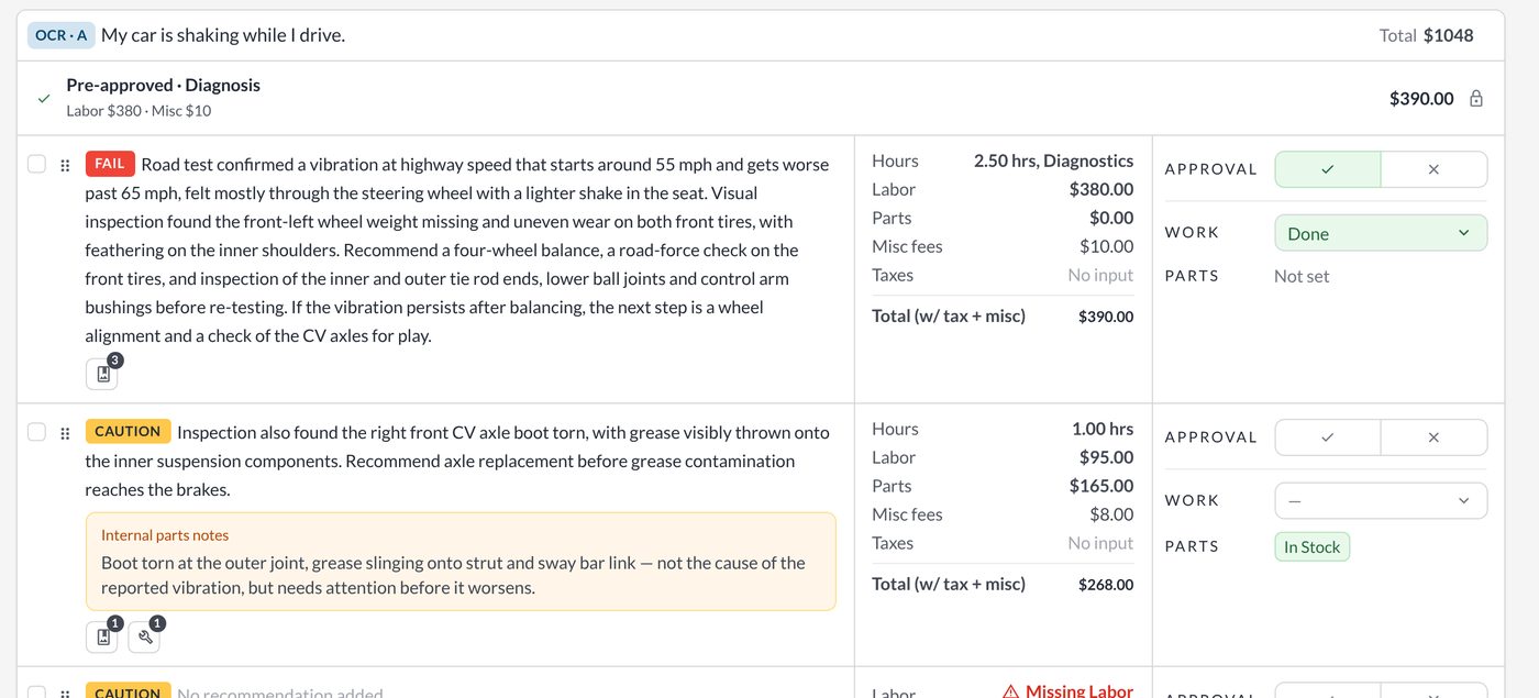
Every recommendation now sits under the concern the customer came in with. "My car is shaking while I drive" is the card; the pre-approved diagnosis, the road-test finding and the CV boot the tech noticed along the way are its contents. The card carries the total, so the advisor can say "the shaking is $1,048 to fix" before going line by line.
The tabs stayed. All, Awaiting decision, Approved and Declined filter the same cards rather than rebuilding the list, so the shape of the page never changes under the advisor's hands.
A concern can also hold no recommendation yet, which is how a tech flags something found but not yet written up. The live tool had no way to say "I saw something" without inventing a price.
One concern, three lines, one total. The customer's words are the heading.FIG. 02
decision/02 · pre-approved
Already approved looks already approved.
In pilotStatus designUsability tests
Work the customer agreed to at check-in used to appear as just another recommendation, so advisors re-asked for approval the customer had already given. It now lives in a green band at the top of the concern, labelled with when it was approved, and is counted in the totals as approved rather than recommended.
This was the single most-asked-for change in testing and the one that most changed how advisors talked on the phone: "you've already approved the diagnosis; here's what it found."
On the Parts tab the same line shows "Approved at write-up" so the counter knows it can be sourced immediately. Same field, same colour, two tabs.
Parts tab: the same pre-approved line, the same green, with the filter counts the parts counter works from.FIG. 03
decision/03 · approval
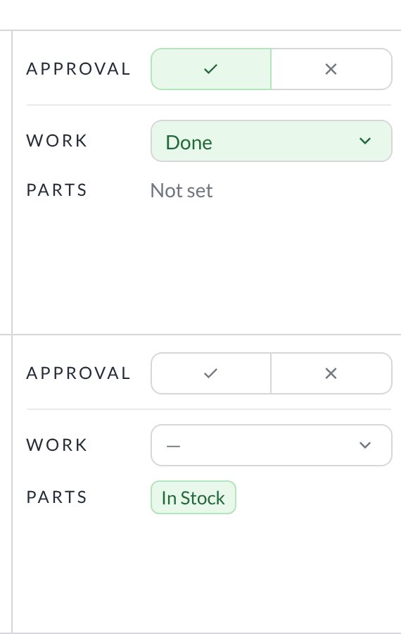
Approve or decline in the row.
In pilotProgressive disclosureSupport tickets
Approval used to be a modal. It is now a tick and a cross on every recommendation, with the work status and the parts status alongside, so the advisor can see at a glance what has been agreed, what is being done and what is still waiting on a part.
The three columns are deliberately the same height as the labour, parts and tax breakdown next to them: approval is read against the money, not in a separate step.
Declined work is kept and totalled rather than hidden. Dealers wanted to see what the customer said no to, for the follow-up call and for the record.
Recommended, declined and approved stay visible at the bottom of the tab.FIG. 05
decision/04 · parts
Parts with the status of the push.
In pilotWorkflow designDealership visits
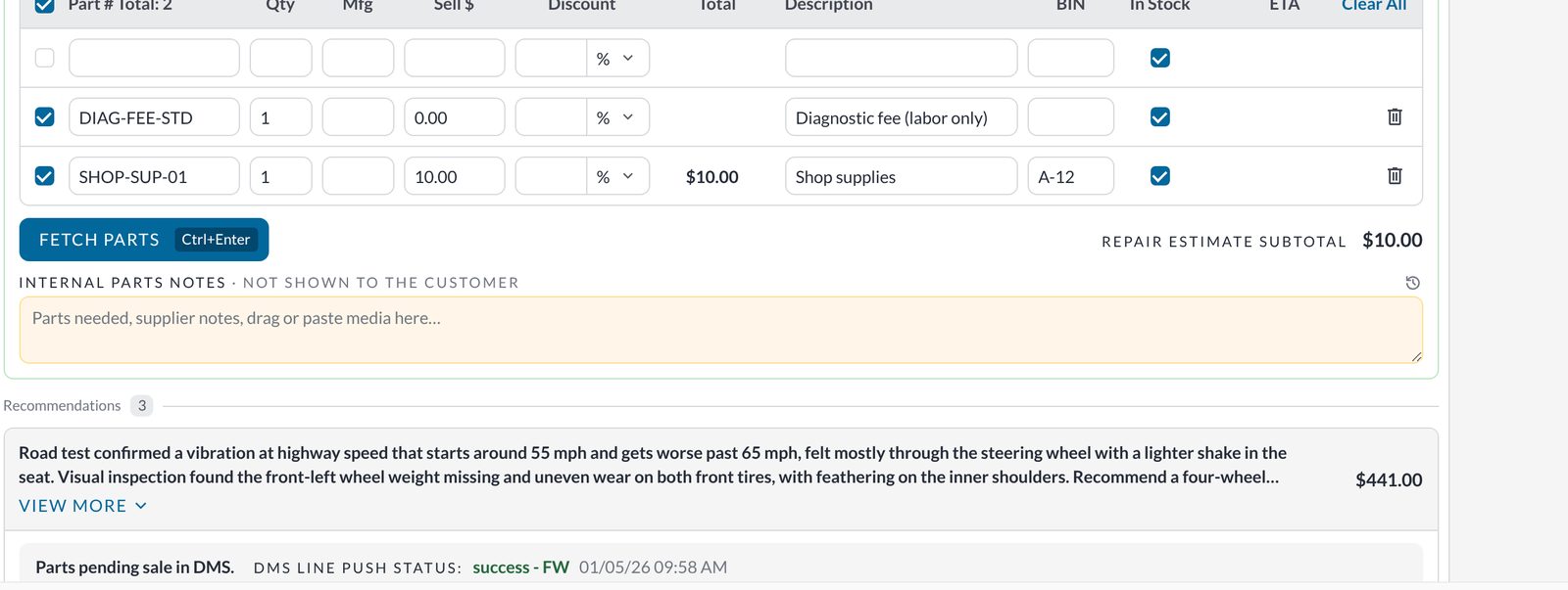
The parts counter needs three things per line: is it in stock, has it been sent to the dealer management system, did the push succeed. The Parts tab shows all three inline, with the DMS push status and timestamp under each recommendation and one "Mark parts added to DMS" action at the top.
Internal parts notes are a separate yellow field, never shown to the customer. That distinction was invisible in the live tool and had caused at least one awkward conversation.
The table keeps the fields the counter already uses, in the order they use them, and "Fetch parts" is one click with a keyboard shortcut.
Parts, subtotal, internal notes. The yellow field never reaches the customer.FIG. 06
decision/05 · media
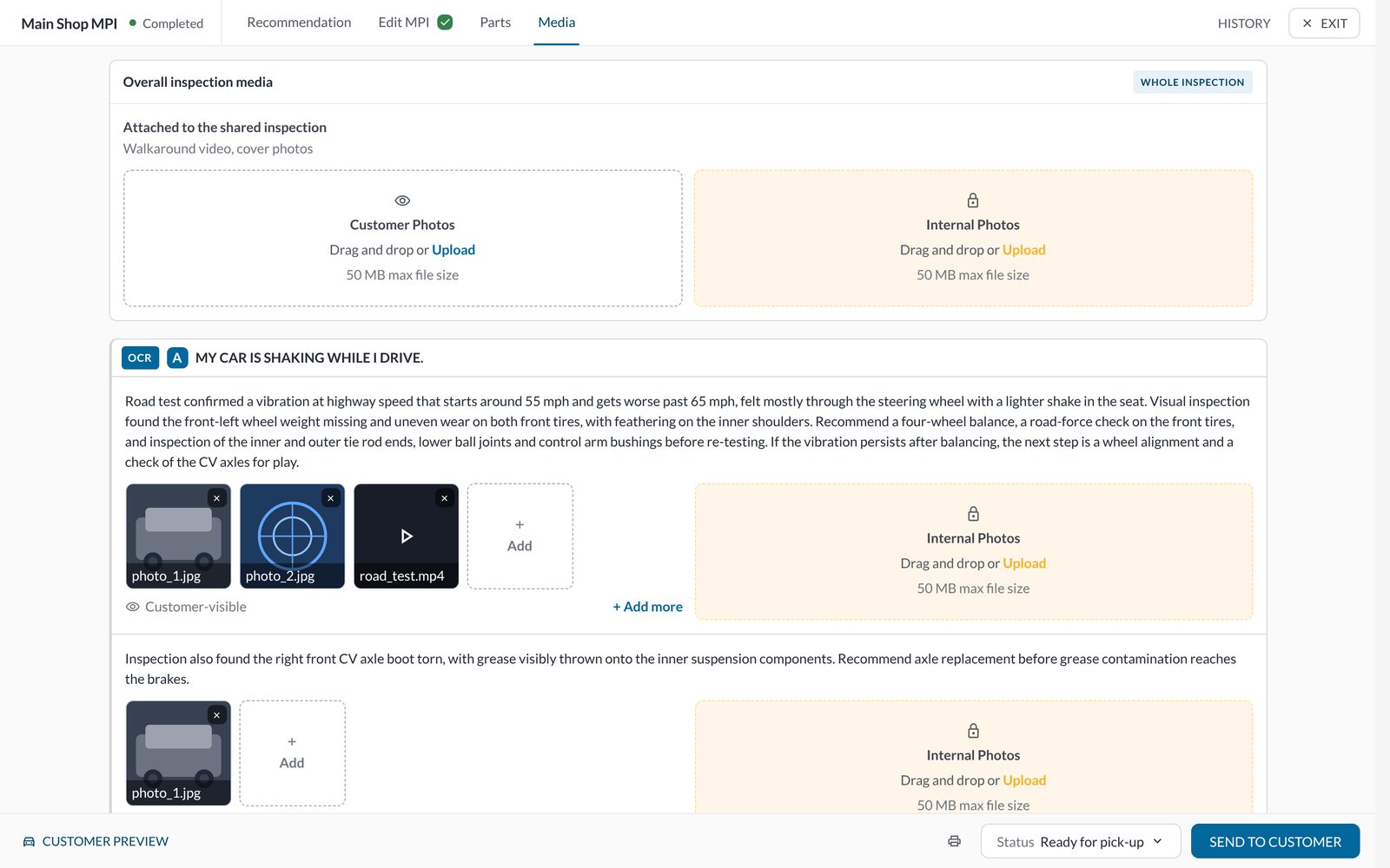
Photos and video per concern.
In pilotEvidence designTechnician interviews
Technicians attach photos and video to make the case for a repair, but the live tool stored them against the whole inspection, so an advisor had to hunt for the picture that went with a specific finding. Media now attaches at two levels: the shared inspection and each concern.
Customer-visible media is separated from internal photos, with the same yellow treatment as internal notes, so nothing a tech shot for the shop's own reference ends up in front of the customer by accident.
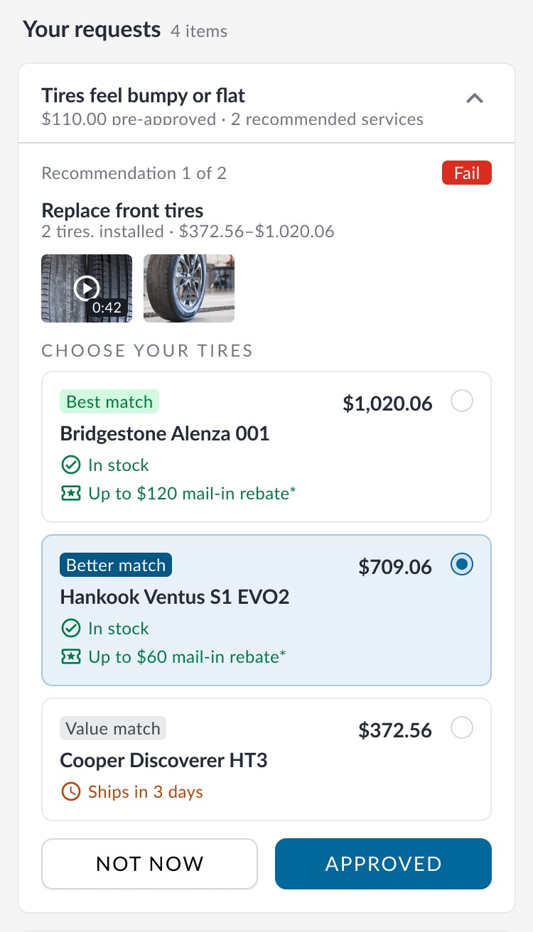
The customer's link mirrors the concern structure exactly: their own complaint as the heading, the pre-approved work marked as already approved, and the findings underneath with their photos and video. Where there is a choice, like tires, the options sit side by side with price, stock and rebates, and each finding ends in one decision: Not now or Approve.
Because it reads from the same record, nothing has to be re-entered or re-ordered. If the advisor regroups a recommendation, the customer sees the regrouping. That was the whole argument for building the structure once, underneath, rather than per tab.
FIG. 08
04 · Where it is
In pilot. Here is what we know so far.
RecLink is a working prototype, in pilot and awaiting launch, so there are no production results yet. The evidence so far comes from usability sessions and pilot feedback. The launch measurements are planned and have not been taken.
Status
Prototype
Working prototype, in pilot
Concern grouping, pre-approved status, inline approval, parts with DMS status and per-concern media, across three tabs, with 40 automated checks protecting them. Not yet released to all dealerships.
In pilot
Observed in usability sessions and the pilot
Test groups
8 + 5
Dealerships and internal users went through the prototype in usability sessions. One group had a poor session in the same month their dealership went through onboarding and a tool change; the result did not repeat with other groups.
Observed
Dealers
Asked for it
Several pilot dealerships asked when they could have it; the pre-approved band was the most-mentioned change.
Pilot feedback
Internally
"When?"
Customer-service staff kept asking when it would go live.
Pilot feedback
Planned for launch
At launch
Three measures
Time from inspection to estimate sent · approval rate on first send · advisor re-explanations per call, from support tickets.
Not yet measured
Methods: user interviews, usability tests, review of support tickets and dealership visits, automated browser checks on every change.
I also built Testify to plan usability studies and check that prototype comparisons measure the intended differences. Explore Testify →
05 · Differently
What I'd change with hindsight.
I'd have written the cross-tab check before the first feature, not after the first bug. Every defect in this project had the same shape: correct in one tab, wrong in another. A script that opens the same recommendation in all three tabs and diffs what it sees would have caught most of them before a person did.
I'd also have moved the prototype onto myKaarma's design system earlier. Settling the structure in a plain skin was right, but a round of testers reacted to the unfamiliar look before they reacted to the structure, and that cost a session.